SMOOTHIE KING
Brand Value Up Rebranding
Brand Value Up Rebranding
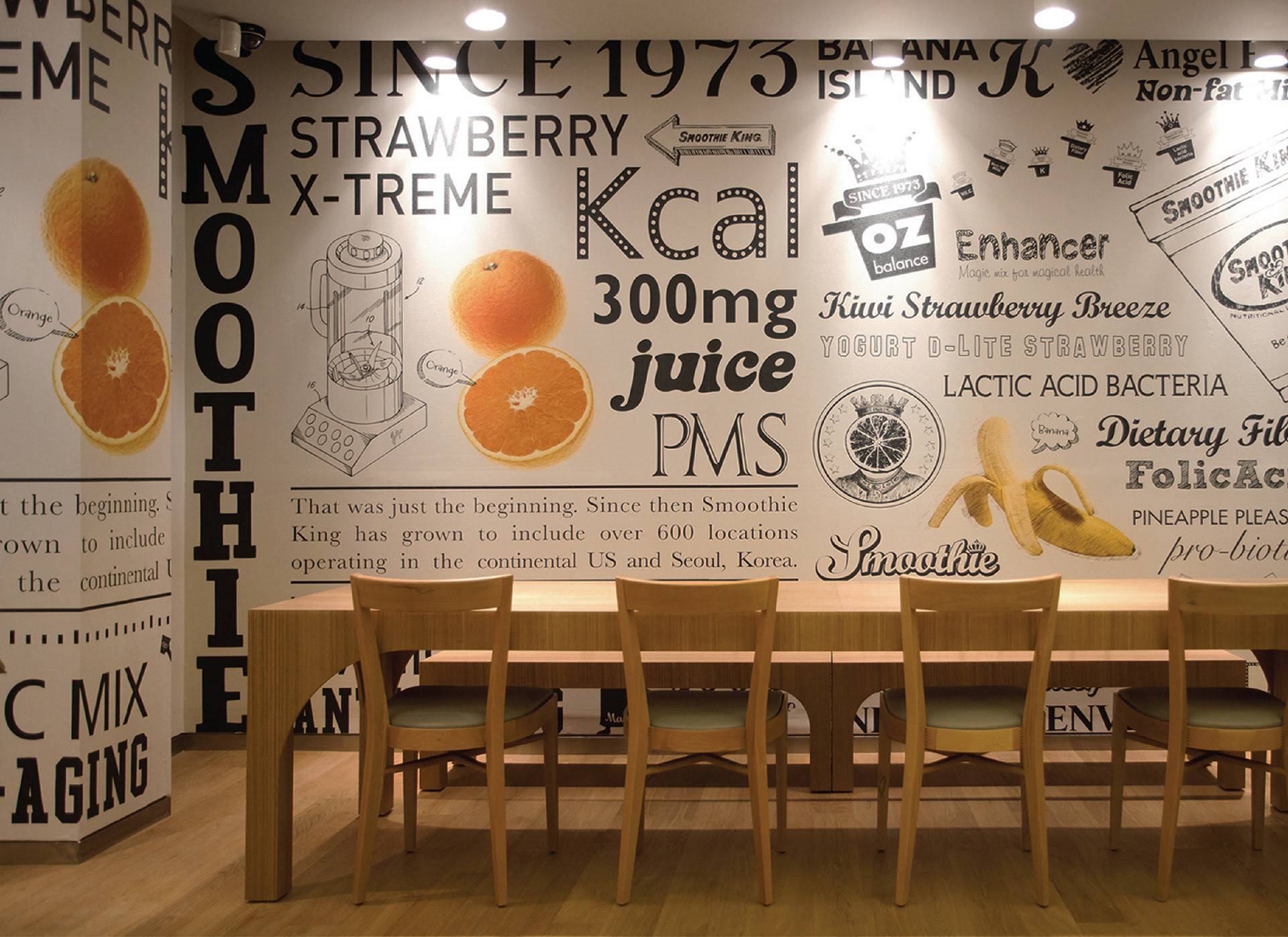
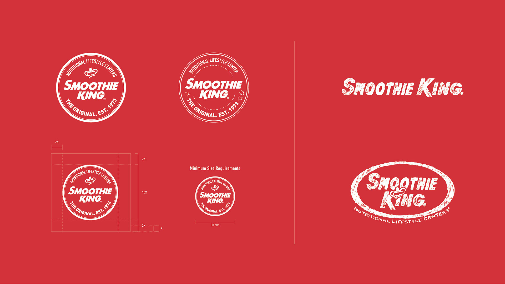
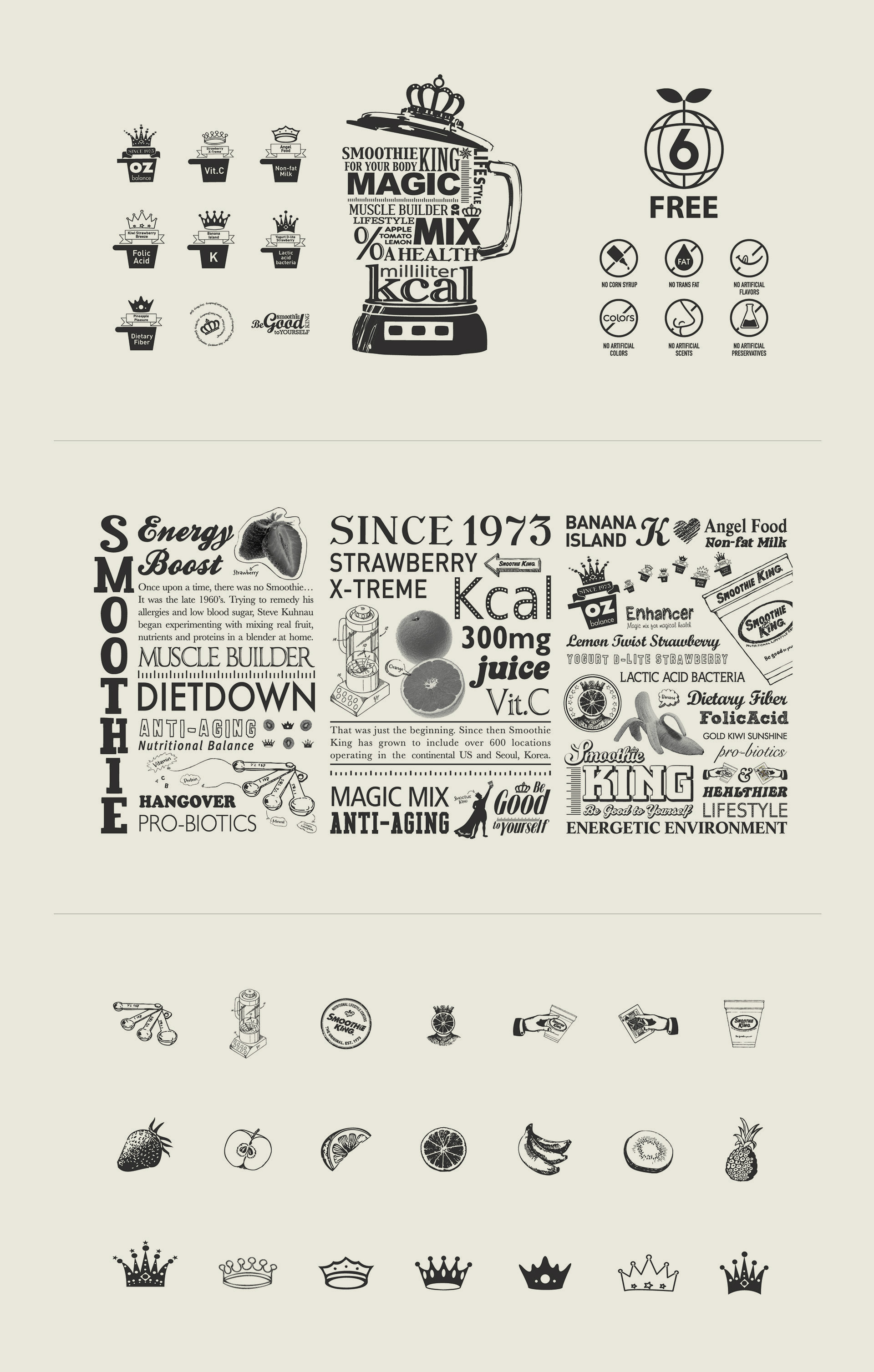
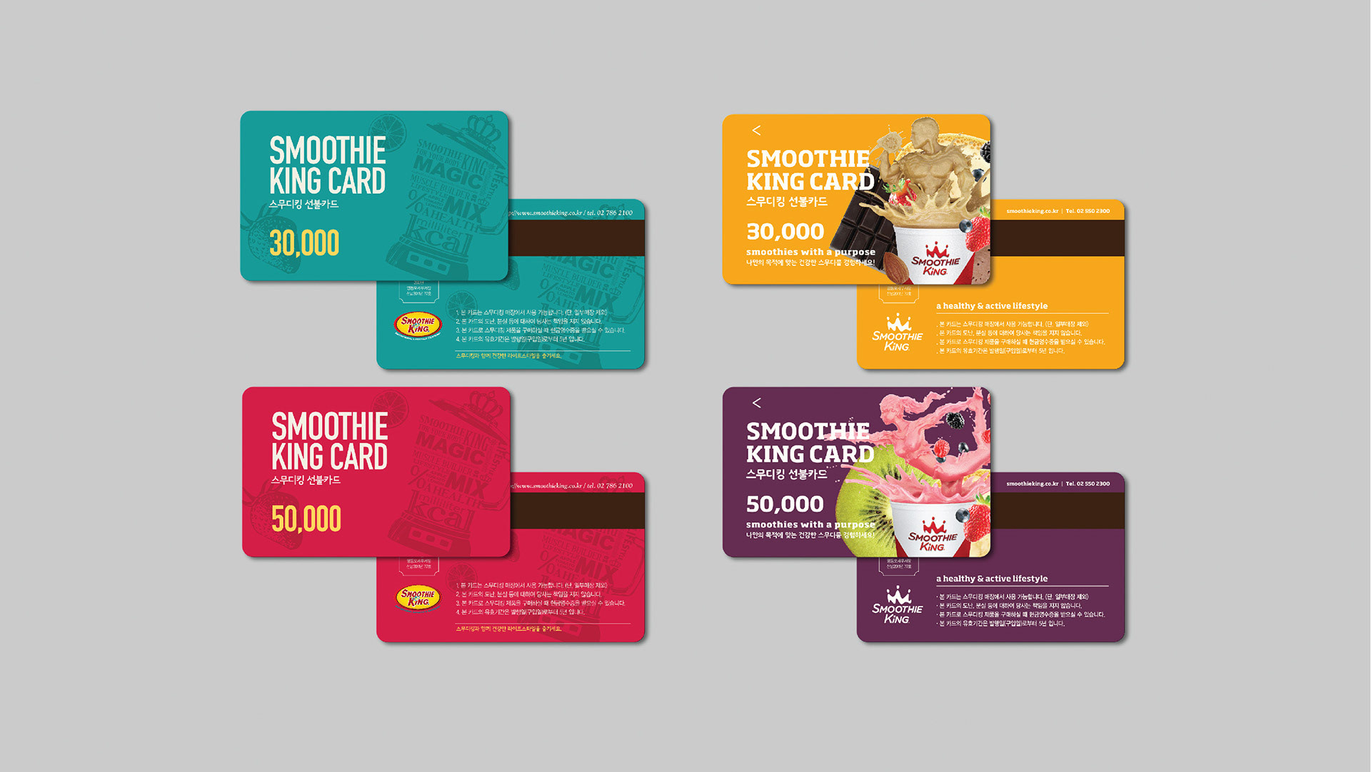
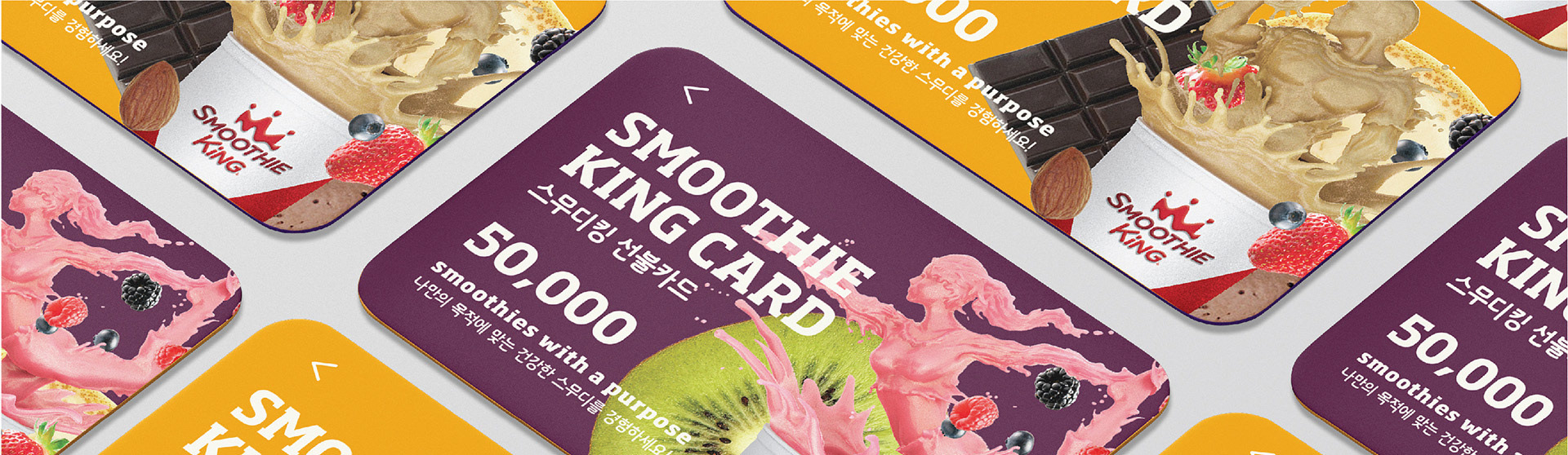
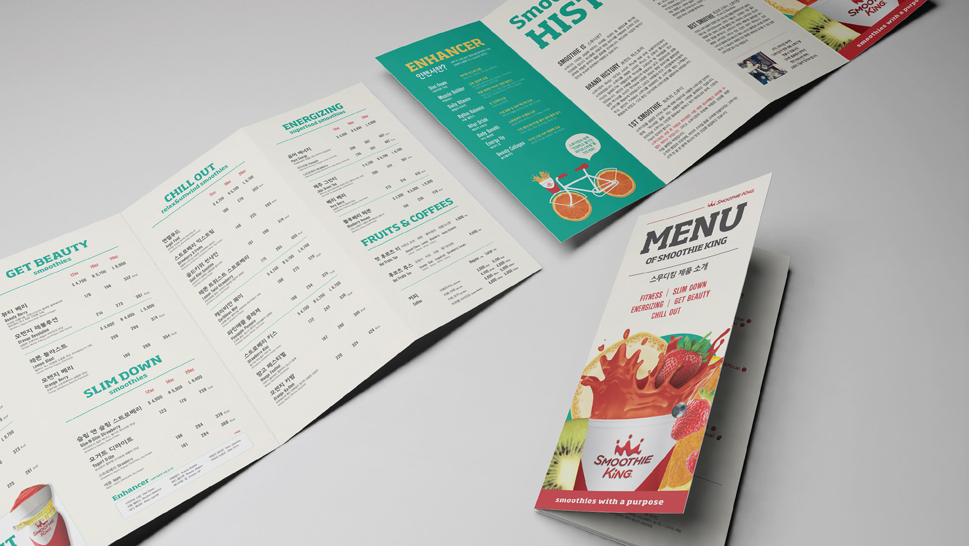
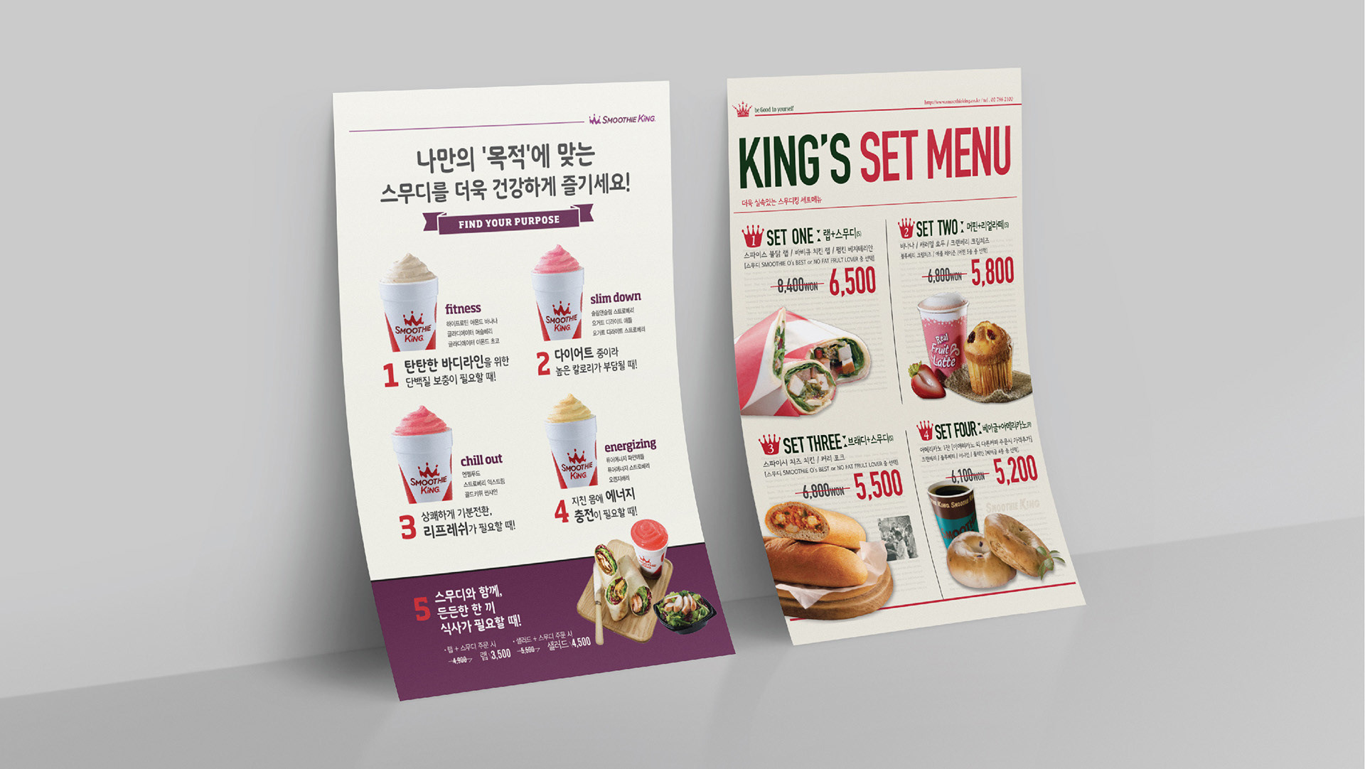
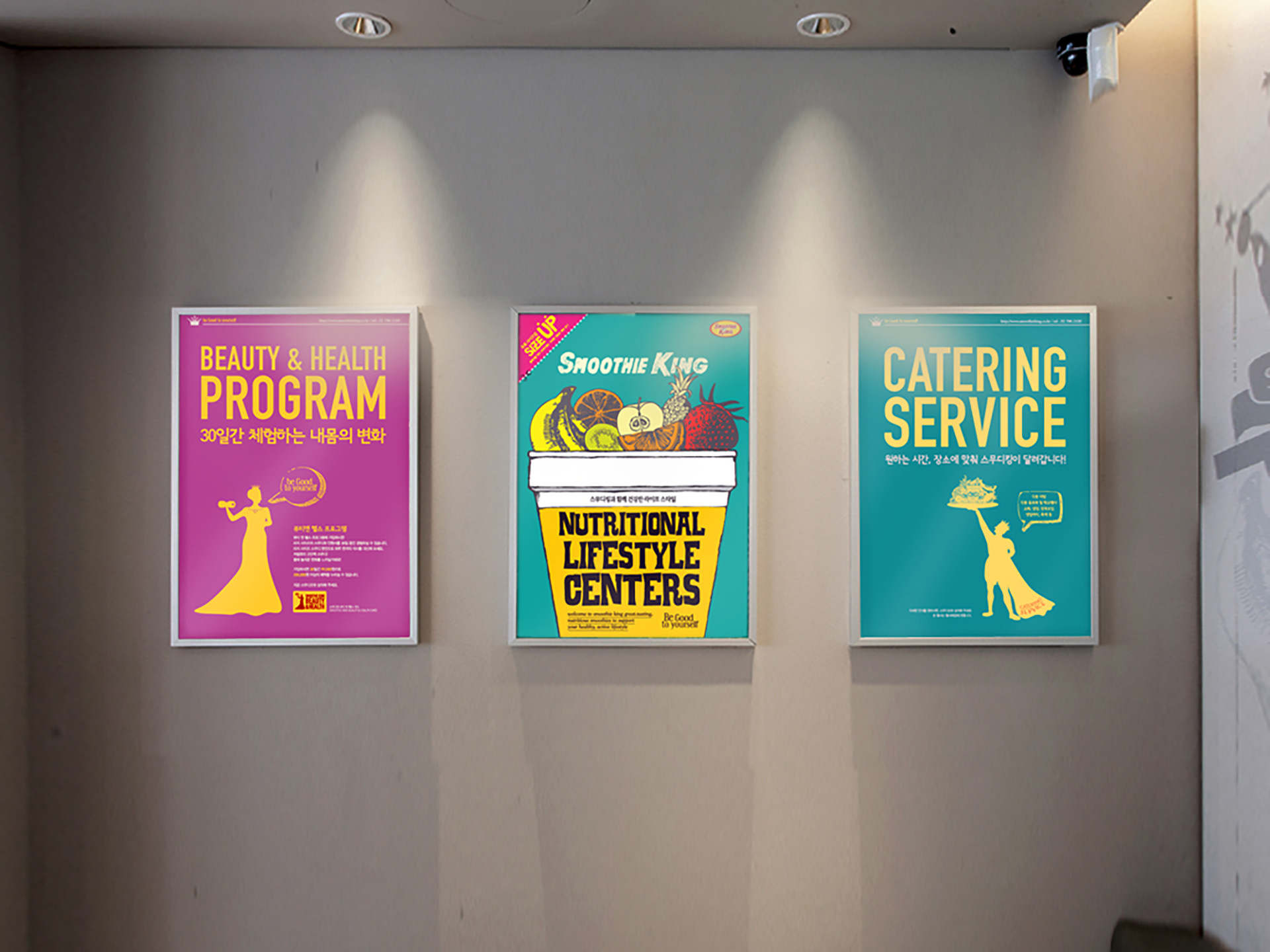
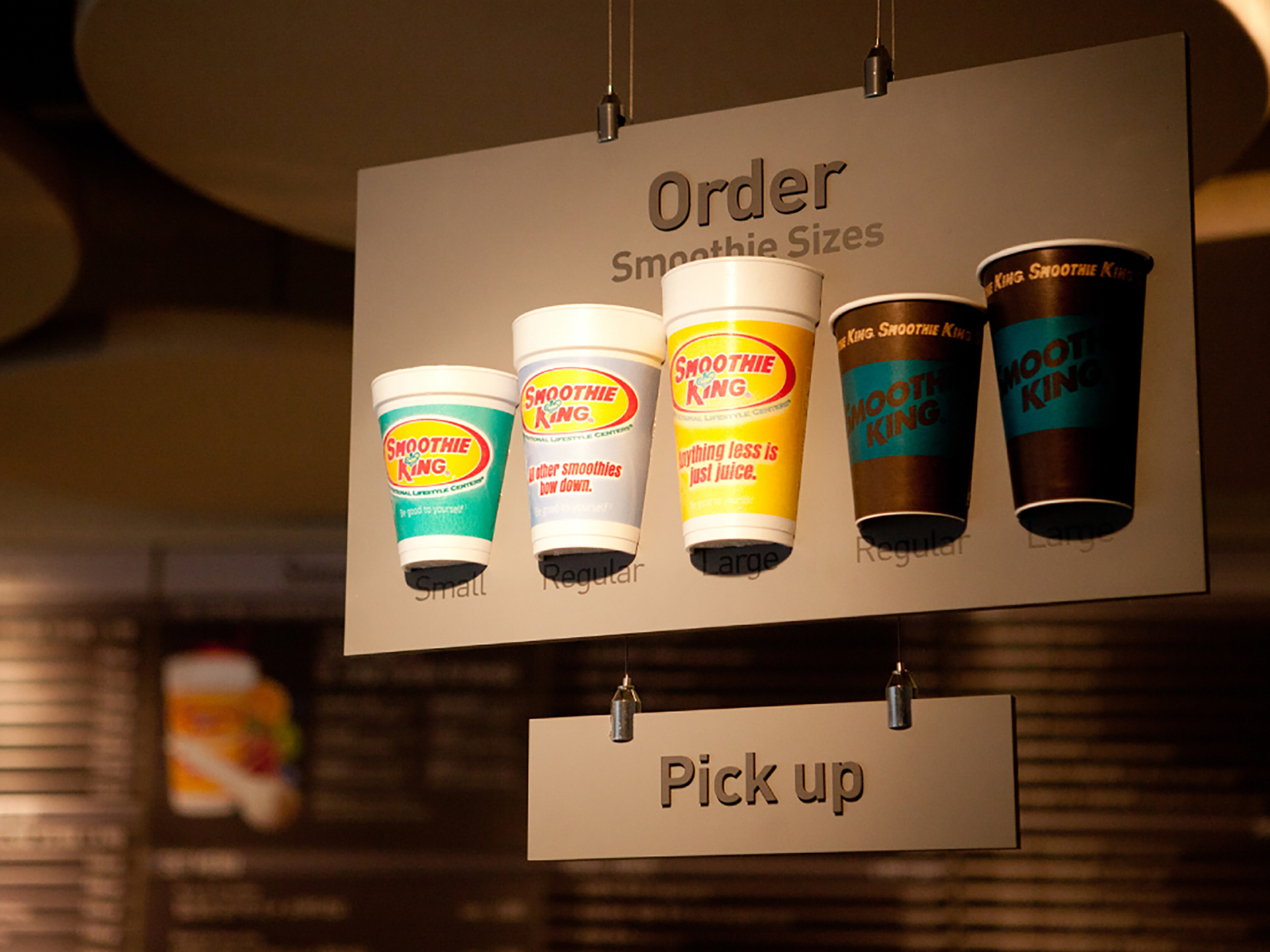
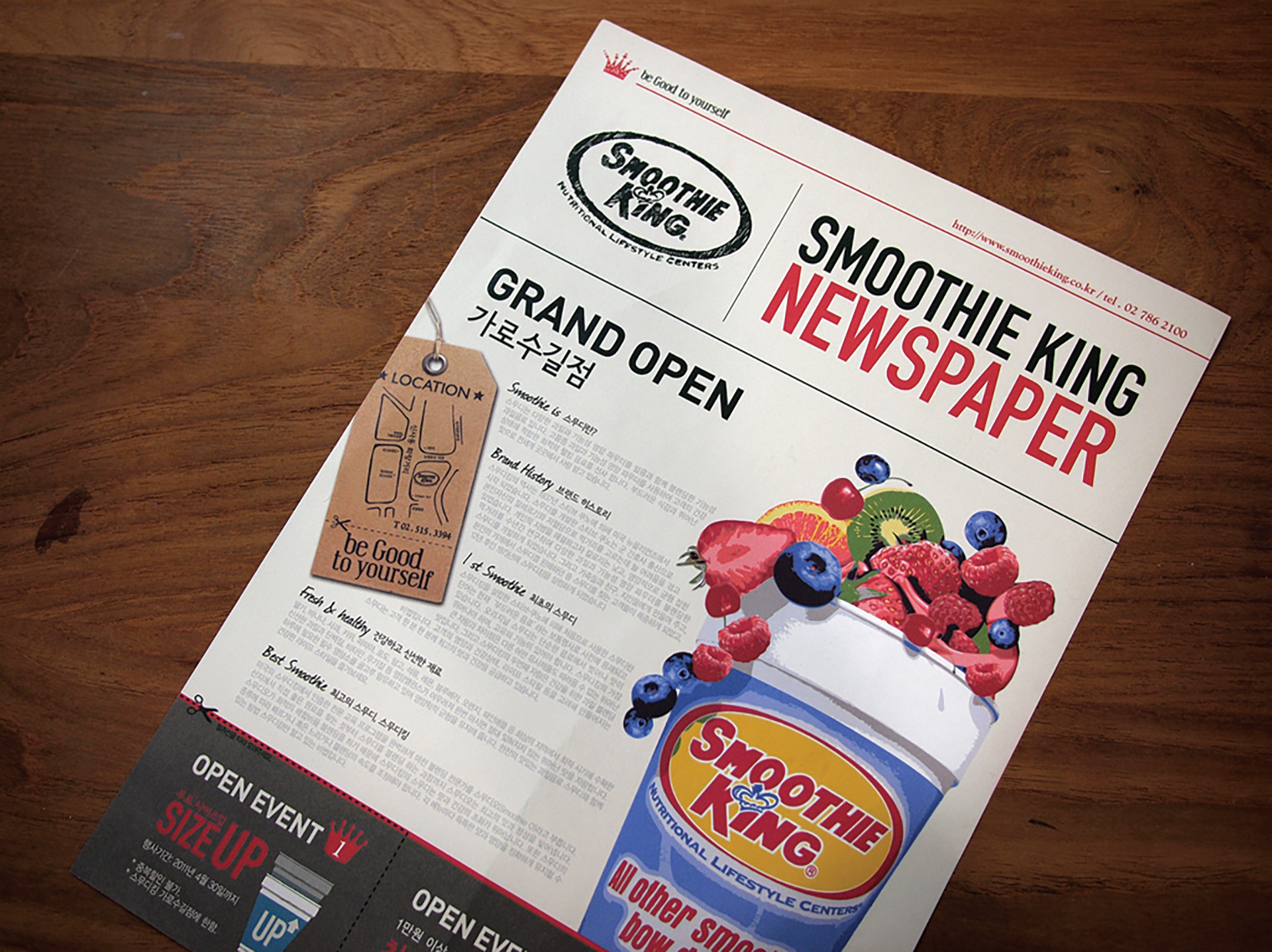
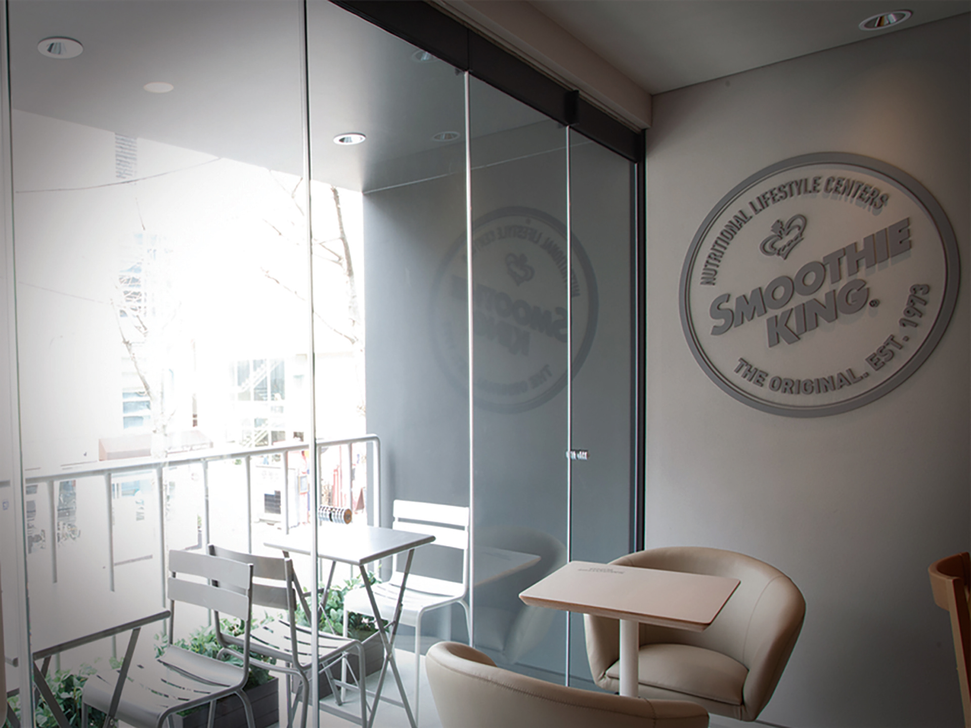
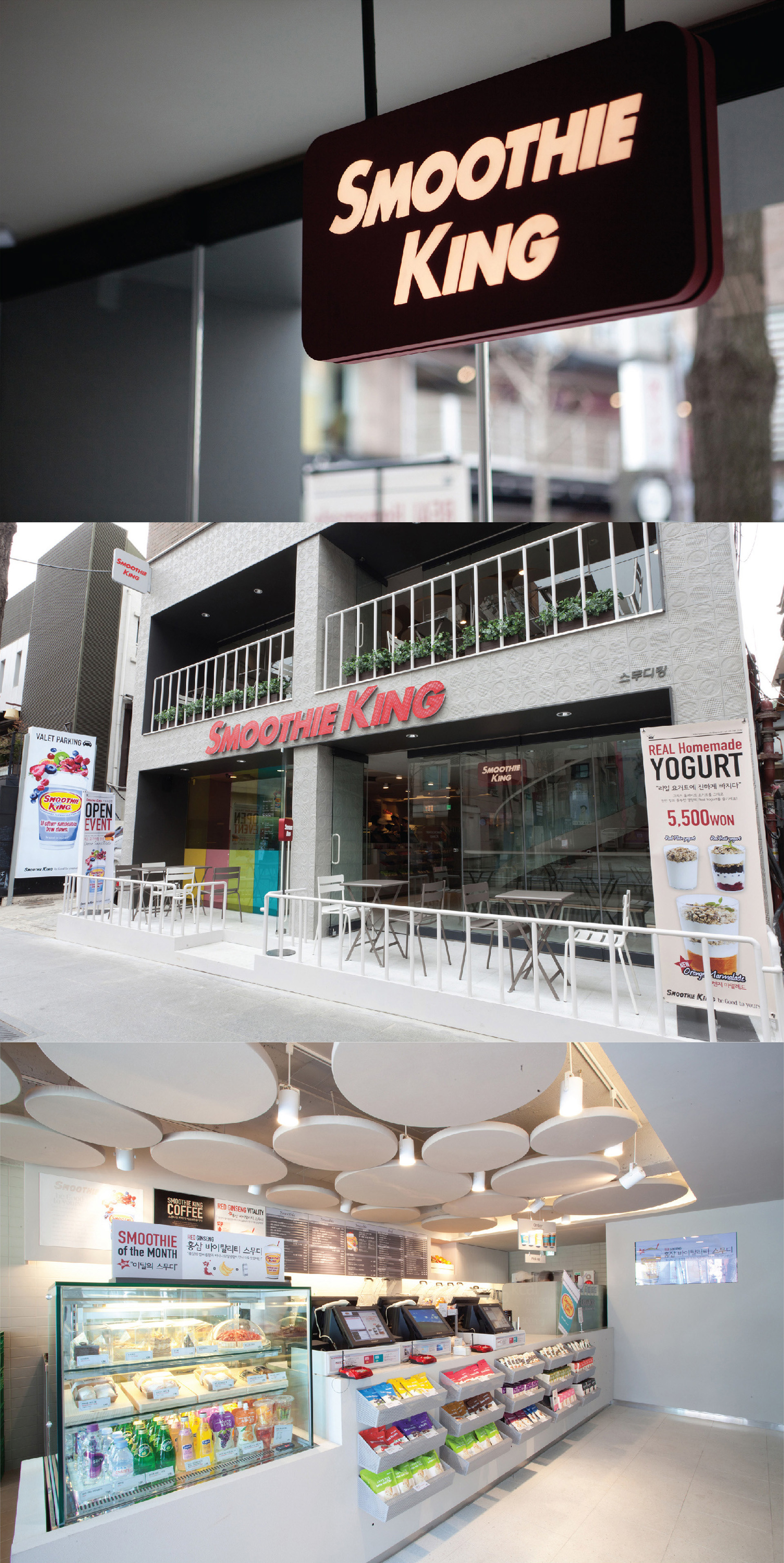
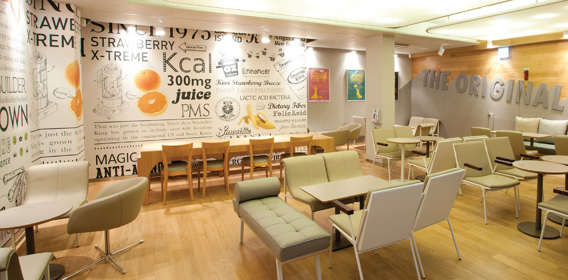
To break away from its brand identity and unpopular beverage stores, Smoothie King Korea carried out a brand design renewal, starting with the Gangnam store in Seoul. In order to break away from the one-dimensional image of fruit beverage stores, a clean image of white and gray tones was applied as basic tone and manner, and a color system reminiscent of fruit beverages was applied to the design of products issued and sold in stores. In addition, by developing a main wall graphic typography design that unravels the strengths of Smoothie King beverages, we have achieved the effect of recognizing the identity of Smoothie King stores to customers, as well as successful launching and sales in the market by increasing brand value.
Client
SMOOTHI KING Korea.
SMOOTHI KING Korea.
Sector
Food & Drink
Food & Drink
Discipline
Brand Identity
Brand Stretagy
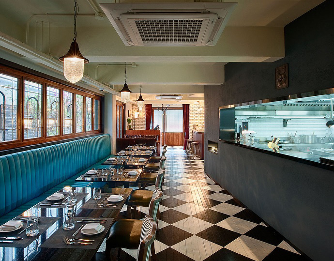
Space Design
Application Design
Promotion Design
Brand Identity
Brand Stretagy
Space Design
Application Design
Promotion Design